
Kippa, Reminders for Microsoft Teams is now 3.5 months old and this series of posts tells the story of his birth.
We started off our journey to build our app for Microsoft Teams in the early stages of the pandemic lockdown and early in the process, we decided to pay forward the experiences we’ve had working in Canada’s tech industry. We wrote a course on how to launch a Startup.
The first post in this series introduced the course, Take Control: Seven Steps to Independence©. You can download it here for free, no registration required.
Post #2 in the series, explained the birth of the idea behind Kippa, our reminder app for Microsoft Teams. It demonstrated how we applied the course’s theory to produce Klippas Technologies inc’s, Kippa – the Microsoft Teams’s Personal Assistant.
We looked at where Kippa came from and why we think it’s a good market. We ended that post with the six questions we asked to validate the idea, the theory covered in the course’s Step 2, Validate. We answered the questions in the post, and followed with the way in which we arrived at the results in Post #3 in this series, which dealt with Exercises 4, 5 and 6 of the course. We ended that post promising to continue in the next one with Exercise 7 and 8.
Post #4 in the series did just that, and showed how we had constructed the business plan for Kippa – Reminders for Microsoft Teams.
Welcome, then, to Post #5 in the series. It introduces you to the theory of designing a solution’s components, functions and artifacts. The terminology in the course was probably foreign to most of you, but we tried to show how to use the approach to design… Well that’s just it, isn’t it? We were attempting to show a person how to design any type of solution. To give you a generalized approach to the design of a product or service. Not easy, as of course all products and services demand that you design them with their purpose and function in mind.
So, in this post I will try to give you some idea of how we used the approach to design our Kippa, Reminders for Microsoft Teams app. As an app for Microsoft Teams, he does of course have to be a specific kind of app. He has to reside inside Microsoft Teams, and he must at all times behave himself in that place. According to Microsoft’s guidelines, Kippa must always degrade gracefully. It’s their polite way of saying he can’t just crash and burn. He has to say he’s having problems, and slowly exit stage left rather than freeze, or worse yet, crash the machine! And then there are a host of guidelines which dictate the look and feel of Kippa’s User Interface’s graphics and icons.
Of course, the guidelines don’t dictate Kippa’s functions. He’s being built as a Microsoft Teams Personal Assistant, and his first function is to remind Microsoft Teams’ members not to forget anything important. Obviously, his design must provide this function.
To begin the process of designing Kippa, we decided to create a Touchpoint Catalog. The course showed you two ways to create this catalog: using a spreadsheet, or using something more graphic like a mind map.
KTi’s view of the process of designing a User Experience is that there are 3 immutable laws:
- 1) Always work from the user’s point of view (POV) and never from your own.
- 2) Make it as easy as possible.
- 3) Make what the user has to do, obvious.
They sound easy, but getting these three concepts right, is what separates great solutions from mediocre ones. In our case, we wanted to make Kippa so easy to use for a Microsoft Teams member, that he or she would never think twice about how to issue a reminder.
The mind map shown as this post’s featured image at the top reveals the process we used to design Kippa – Reminders for Microsoft Teams. And the mind map we mentioned of what the Touchpoint Catalog looks like is this:

Kippa, Reminders for Microsoft Teams, Touchpoint 1 Catalog entry
Obviously this is the generalized sample and not the one we used to design our Personal Assistant for Microsoft Teams. Give us a break, will ya? We’re in a competitive market place!
But we will tell you this: We’re much better at this than our main competitor, Reminders for Teams, and the app which they have religiously copied, Slack’s Slackbot /Remind feature. The reason I can make this statement with absolute certainty is a good example of what we meant by rule number 2 of UX design: make it easy.
In both Slack and our competitor in the Microsoft Teams market, you, the user, have to deal with Time Zones manually. In other words, if you want to send a reminder to a team member in a different time zone from your own, you have to calculate the time in that remote zone and then use that time in your reminder. And if you’re sending this reminder to Microsoft Teams members (plural), you have to send a special version of your reminder to each person in a different time zone.
And we figured that just not right! No, instead we spent a long time thinking of a way to do this automagically! Yup, when you use Kippa to send a reminder to a Microsoft Teams member (or members), you send it out using your own local time and Kippa translates that into each member’s time zone. You send your reminder once, no matter how many members it goes to, and regardless of the time zone they are in.
That’s the secret: no matter how difficult it is for you to design the solution to be easy for the client, you have to tackle the issue and triumph. If you don’t, you do what Slack and the other guys did. Make it easy to develop the app and difficult for your users to do what they need to do, using it.
Here’s another look at the process, this time the mind map shows you what to do when you design a component. We used this approach, for example, to design the way Kippa reminds Microsoft Teams users without the user having to worry about time zones.
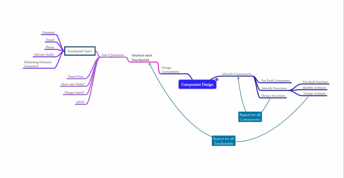
Kippa, reminders for Microsoft Teams’ component design.
The next post in the series will look at Artifacts and how they factor into the design process.
KTi’s Kippa – Fast and Easy Reminders for Microsoft Teams ©
Recent Comments